Preserving ParadiseNovember 2023
Glasgow Clyde College

BRIEF: The goal for this project was to highlight the current state of decline of the Amazon Rainforest. This was to be done by creating a promotional campaign of which included a booklet, a poster and UX/UI design for an app.
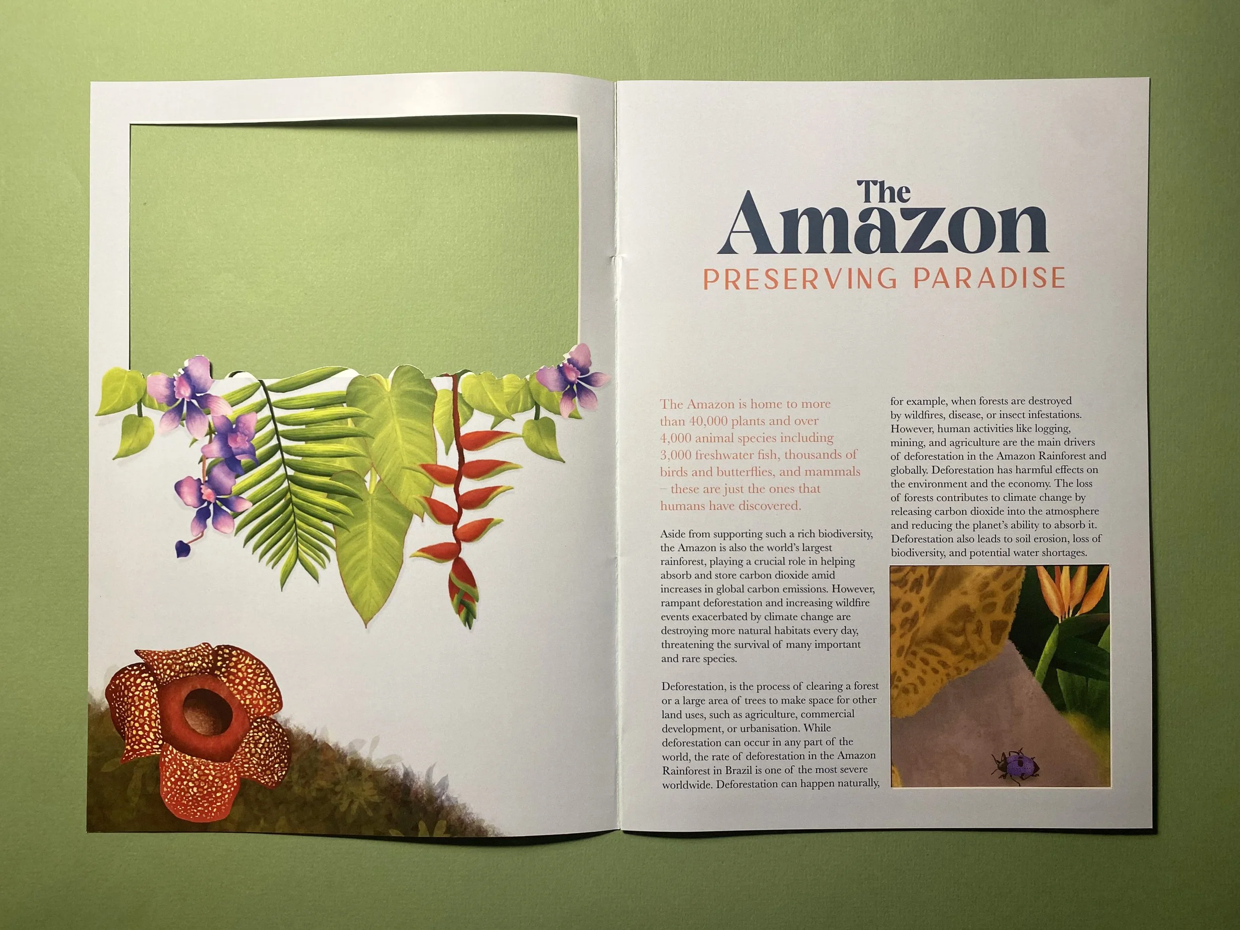
CONCEPT: I came up with four concepts, and the one that was chosen for this campaign was titled “A glimpse into the future”, in which the viewer is given a look into the past and potential future of the Amazon rainforest through the use of window cut outs. This is demonstrated best in the booklet, where as you turn the page you go from a bright, tropical scene, to a dark and fiery one.
As part of the brief I had to choose one species to focus the campaign on, and for this concept I was draw in by the intense stare and patterned fur of the Jaguar. However my sympathy wasn’t just for the animals, but for the exotic and colourful flora that too covers the vast rainforest, so I decided to include some of these as well. Illustrations were also mentioned in the requirements of the brief, and the Jaguar and plant life would become the subject of these.
SOLUTION: During the research stage I explored various styles of illustrations before deciding to go with hand drawn illustrations. This isn’t my speciality but I wanted to push myself outside of my comfort zone and try something different. The illustrations aren’t perfect, but the process helped me to develop my skills using Procreate, and I think they work well for this brief for a couple of reasons. It softens the message and makes it less intimidating to the viewer, hopefully meaning they would be more likely to engage. Also, the imperfections and unique qualities of hand-drawn illustrations can create a sense of authenticity and human connection. This can be particularly important for sensitive topics where trust and relatability are crucial.
The main typefaces I ended up using throughout the designs were Minal, Cremona (logo and headings),and Baskerville (text copy). All three of these fonts feel sophisticated and together create a harmonious family that evokes a feeling of trust and tradition.
The logo represents the threat (fire), the land (the leaves and branches) and hope (the rays of light) for a way through. The branch weaves through the smoke and rises above the flames giving viewers a sense of hope and a common goal, though the fire remains present and just a representation of the list of threats this precious rainforest is faced with.
DELIVERABLES:
Brand ID for the campaign
A2 Poster
Booklet of minimum 6 pages
UX/UI design
Spec sheets for the type elements.